Can you judge a book by its creative director?
Like a duet or dance, it’s about making your creative partner succeed

In 2016 I was approached to write a book. I turned it down, only to find myself working on it a year later. The reason was that along with my initial decline, I had pointed the agents to my friend Panos whom I met through teaching at Berklee College of Music. Panos said he’d love to write it… but only with me. And so we did.
I went into this naively, knowing nothing about writing a book or the mechanics of getting a publishing deal. Thankfully we were guided by our agents, but one thing I regretfully didn’t insist upon was the option to design the cover. To be fair, it probably didn’t occur to my publisher either. How many designer/musician authors had they worked with before?
So when it came time to design the jacket I flipped into creative director mode. Through roughly 15 years of trial and error, I had learned that creative direction is not about telling people what you want them to do—like you’re the head and they’re your hands. Instead, it’s more like dancing, sharing the lead, creating a spectacle from two people moving fluidly through the room.
When our editor asked for examples of book covers Panos and I liked, my first inclination was not to choose any—a classic designer response! Instead, I went to Reid Miles’s Blue Note album covers and the posters of counter-culture-artist-nun, Sister Corita Kent. What tied their bodies of work together was the use of typography as image, a visual approach less common in non-fiction, but one I felt strongly about given the content of the book. Typography, working as an image, was important to illustrate the connective tissue between music, design and entrepreneurship. As we write in the book, these arts are related to one another by similar creative mindsets and I wanted the book cover to imply this idea—it’s not about words or pictures—the words are pictures.
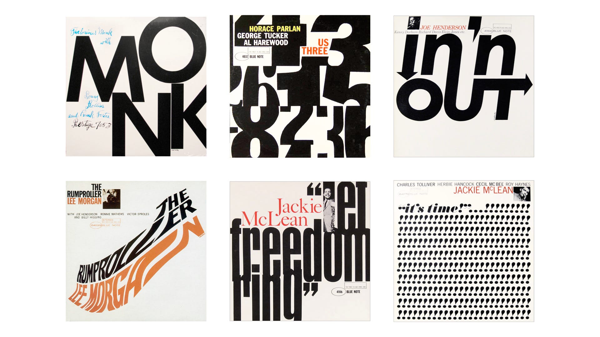

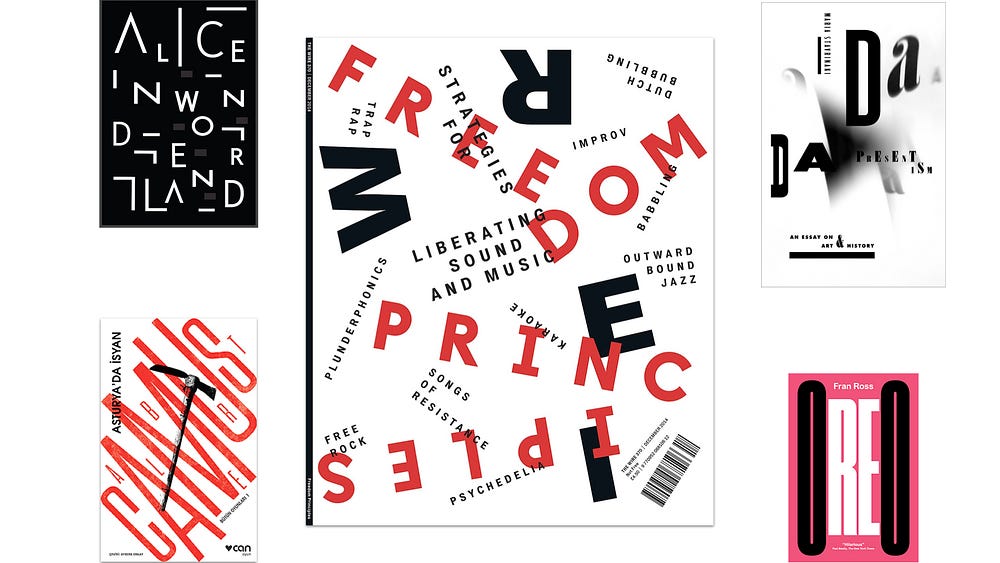
As much as Colleen and Pete (our editor and art director at Public Affairs) appreciated my samples, they pointed out that I didn’t follow the brief. “Send examples of book covers you like,” they emailed again. At first, I scrolled for what felt like miles through Amazon to find a needle in a haystack. I can confidently report that the world is filled with boring book jacket designs—or at least Amazon is. But then I recalled AIGA’s 50 Books/50 Covers competition and hallelujuah!, I had some beautiful samples that communicated the same ideas as the posters and album covers. Reply sent.
The first round from Pete arrived and it was clear he got the vibe. Receiving a design mock-up is a lot like receiving a song demo. You don’t expect it to be done. You expect it to clearly express an intent. The iterative process of sharing ideas back and forth advances it from a prototype to a solution—like a song or a book jacket. Pete’s intent was clear. The type was the central character and Corita’s color palette certainly had an influence. So, where to take it? I wanted the concept of progress and forward movement emphasized. This is the tough part about designing anything that implies what you mean so that people can pick up on it subconsciously. Of the designs, Panos and I had different opinions about which we liked, but we did agree we were on the right path.

I couldn’t help myself and decided to take an afternoon and explore the cover myself, diverging from what Pete had provided to see if other ideas might open up and inform what he’d done. The four directions I designed explored visual elements from music media: record grooves and fast forward buttons. I liked how each could be manipulated to further imply movement, an idea that Pete was clearly exploring as well in his designs.
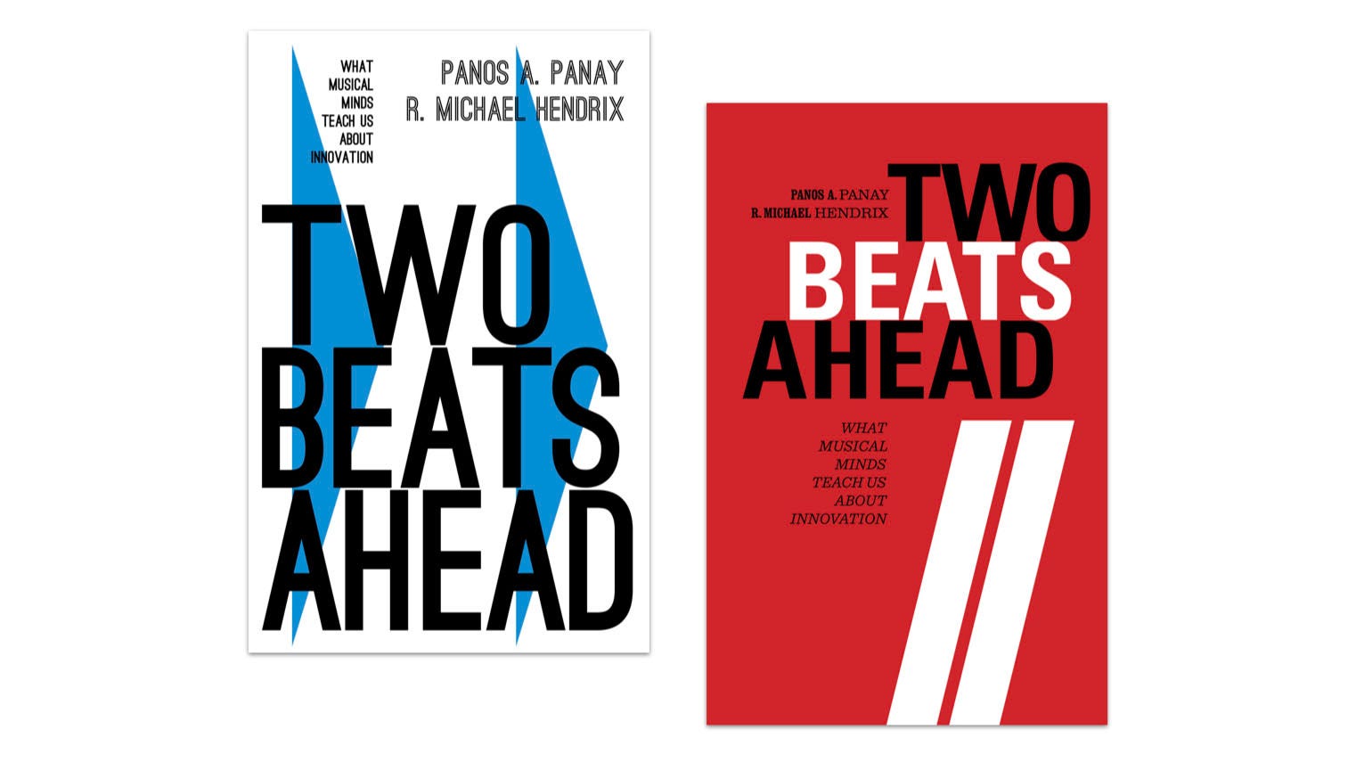
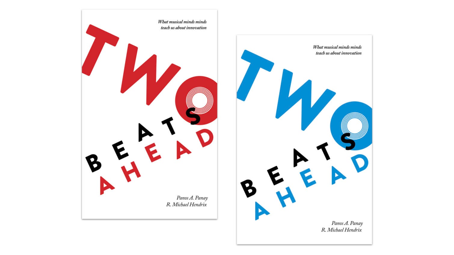
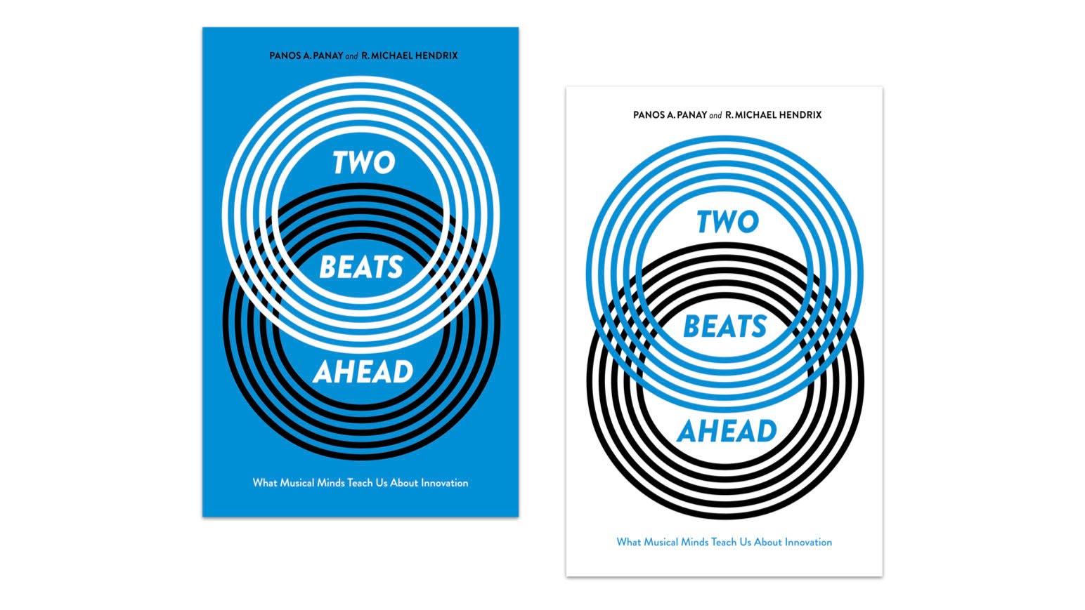
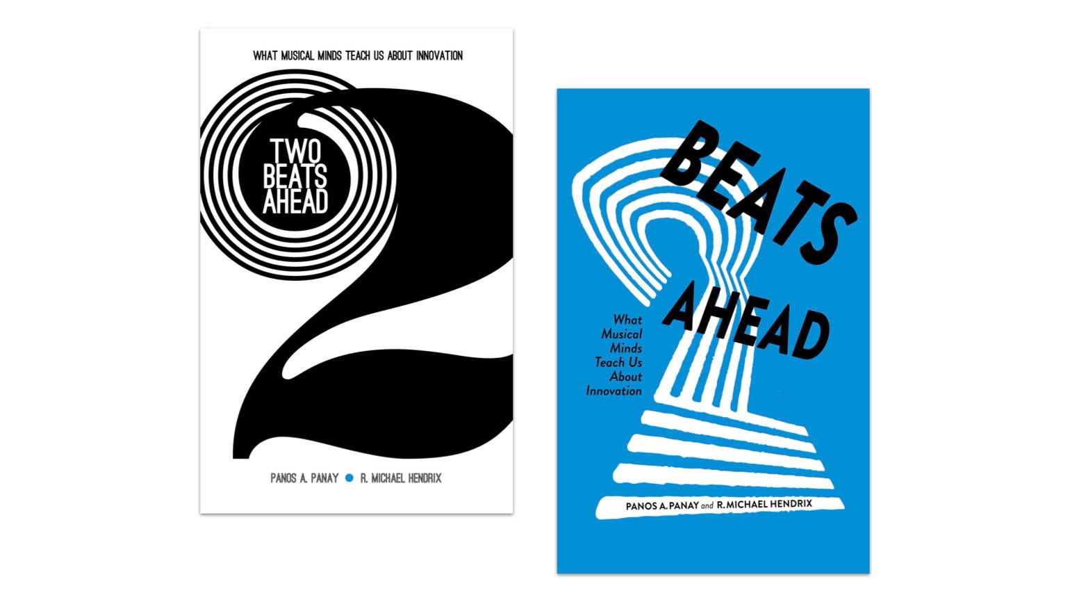
Pete responded by taking the fast forward arrow buttons and placing them behind simplified typography from one of the original directions. We all agreed this was it. It was the minimal amount of information to imply the idea that inspired the book title. In a Fast Company interview, Chance The Rapper said, “ Technology just naturally moves faster than business, and music and thought and ideas move faster than technology. We’re in a position to be two steps ahead.” We riffed on this concept, played with the words, and made it visual.

In Two Beats Ahead, we interview Hank Shocklee, a founding member of Public Enemy, a renowned producer and music executive. He shared a theory of music production with us that illustrates this book cover design process through a provocative question: ‘Does matter define the space, or does space define the matter?’
What he was suggesting is that working with another creative person is never about managing them or telling them what to do. It’s about creating the conditions and inspirations for that person to succeed: define the space so that it’s an ideal environment for them to be their best, for them to move forward.
Learn more about Two Beats Ahead: What Musical Minds Teach Us About Innovation, from Public Affairs in the U.S. and from Penguin Business (with a different cover!) in the U.K.

